First, I did some simulations to see what I thought I might be able to get away with in the dimensions of the space. this movie shows the bi-level set from multiple angles, and has a "person" walk across the front of the stage. I wanted to see how smooth the lighting spread was, how much spill was on the audience, and whether the big pole in the middle of the room was going to cast ugly shadows.
The following images show how well the production turned out (right-click and "view image" to see the images at full size):
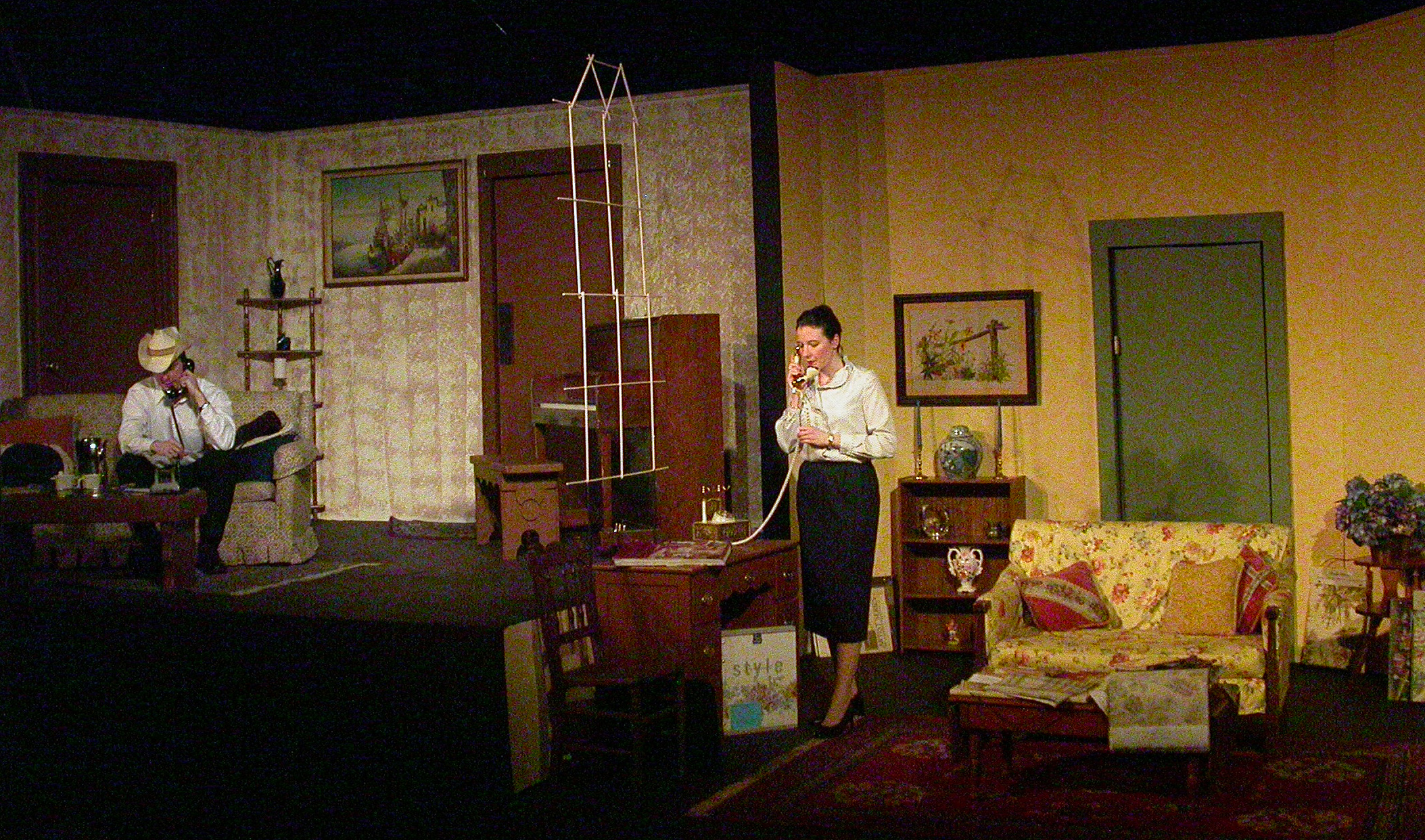
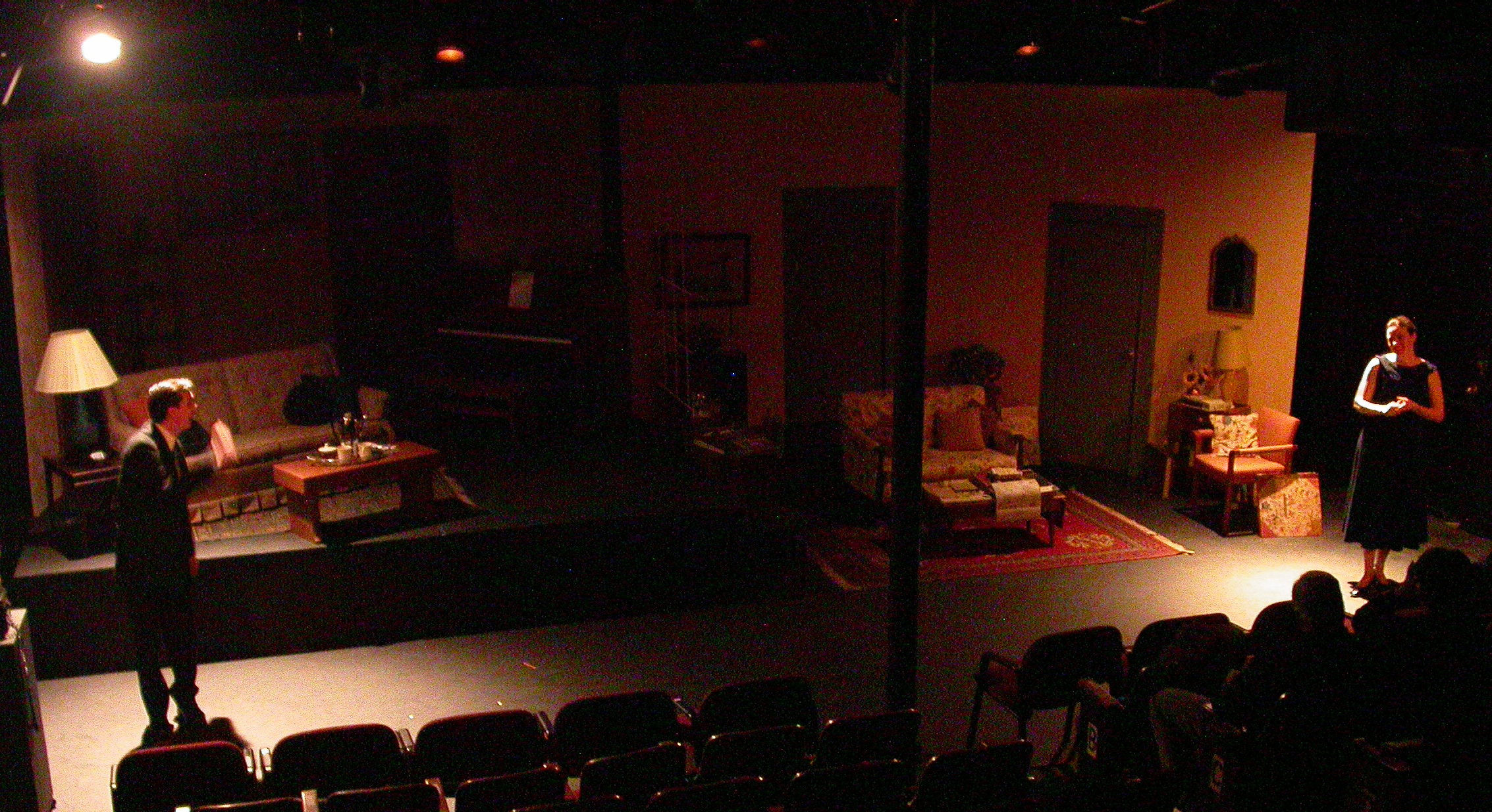
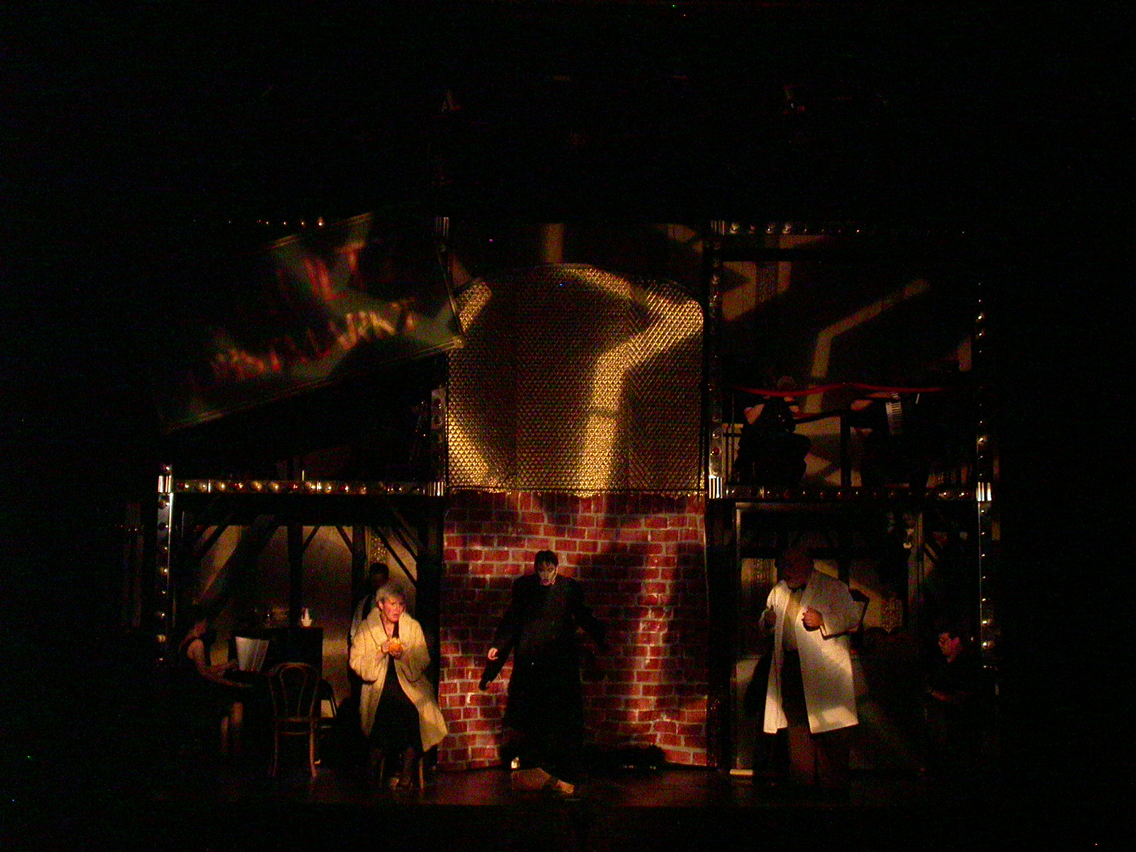
Here is the full stage, so you can see the color palette difference
between the two sides of the stage.
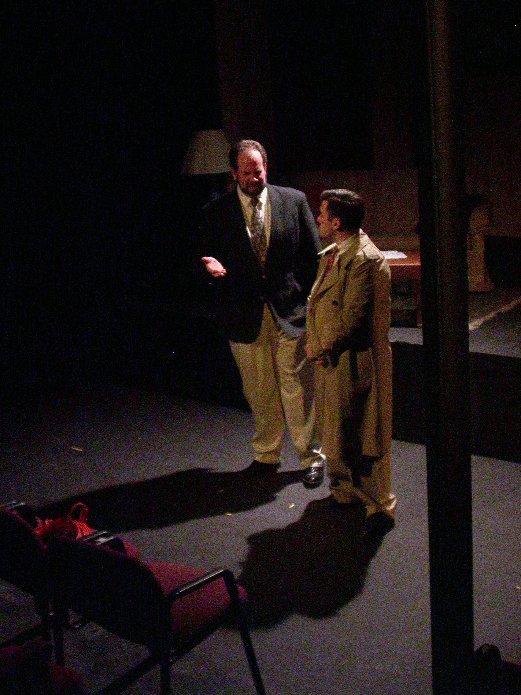
The down front area had to serve as all the other scenes outside
the two apartments. Here is a fancy restaurant:
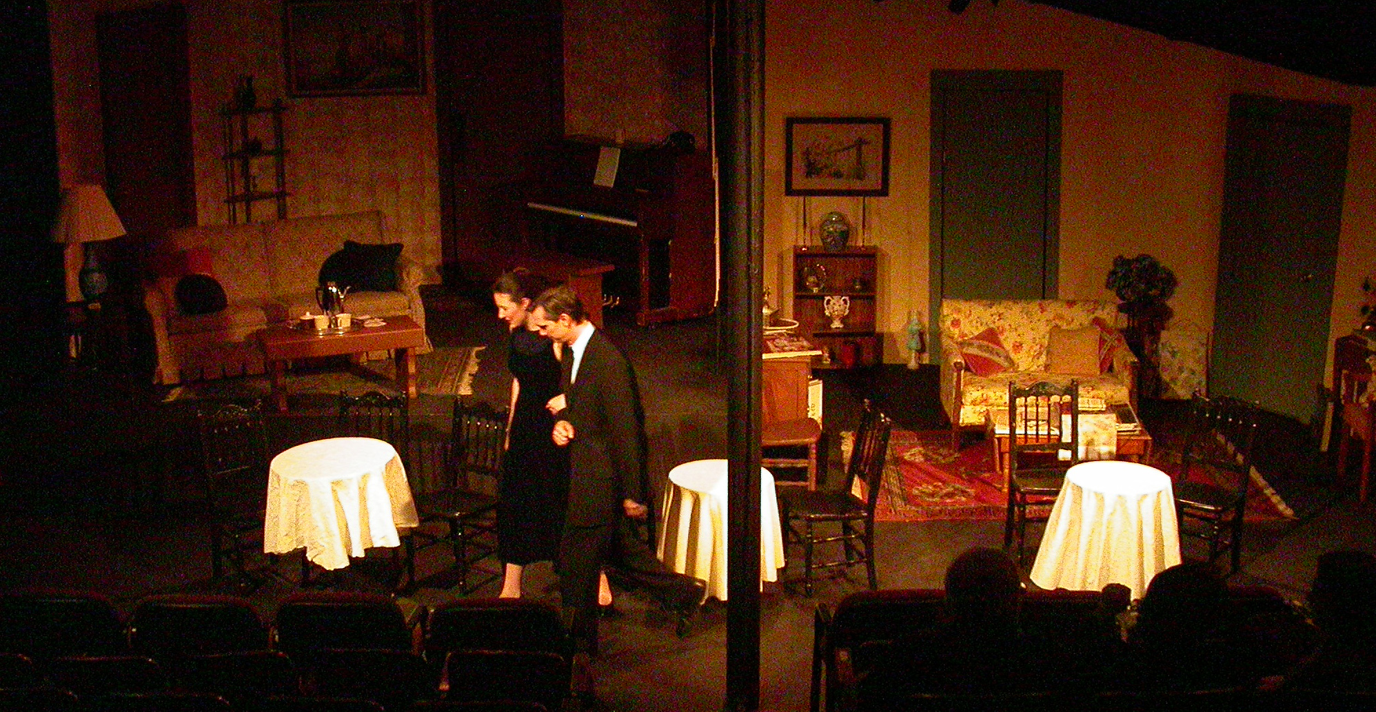
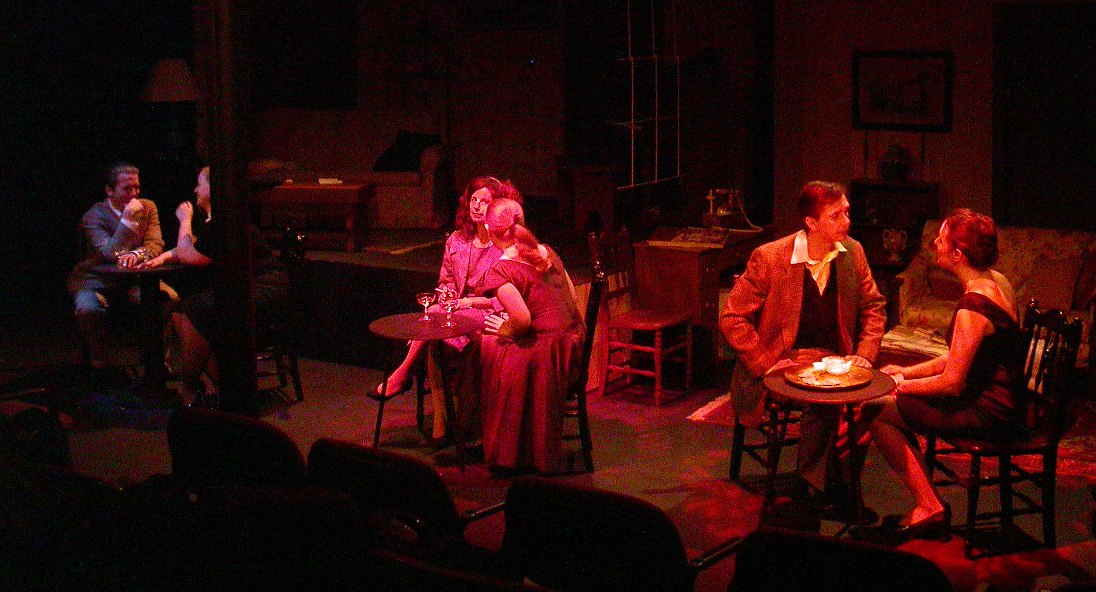
And a nightclub.
Streetlights on a city street:
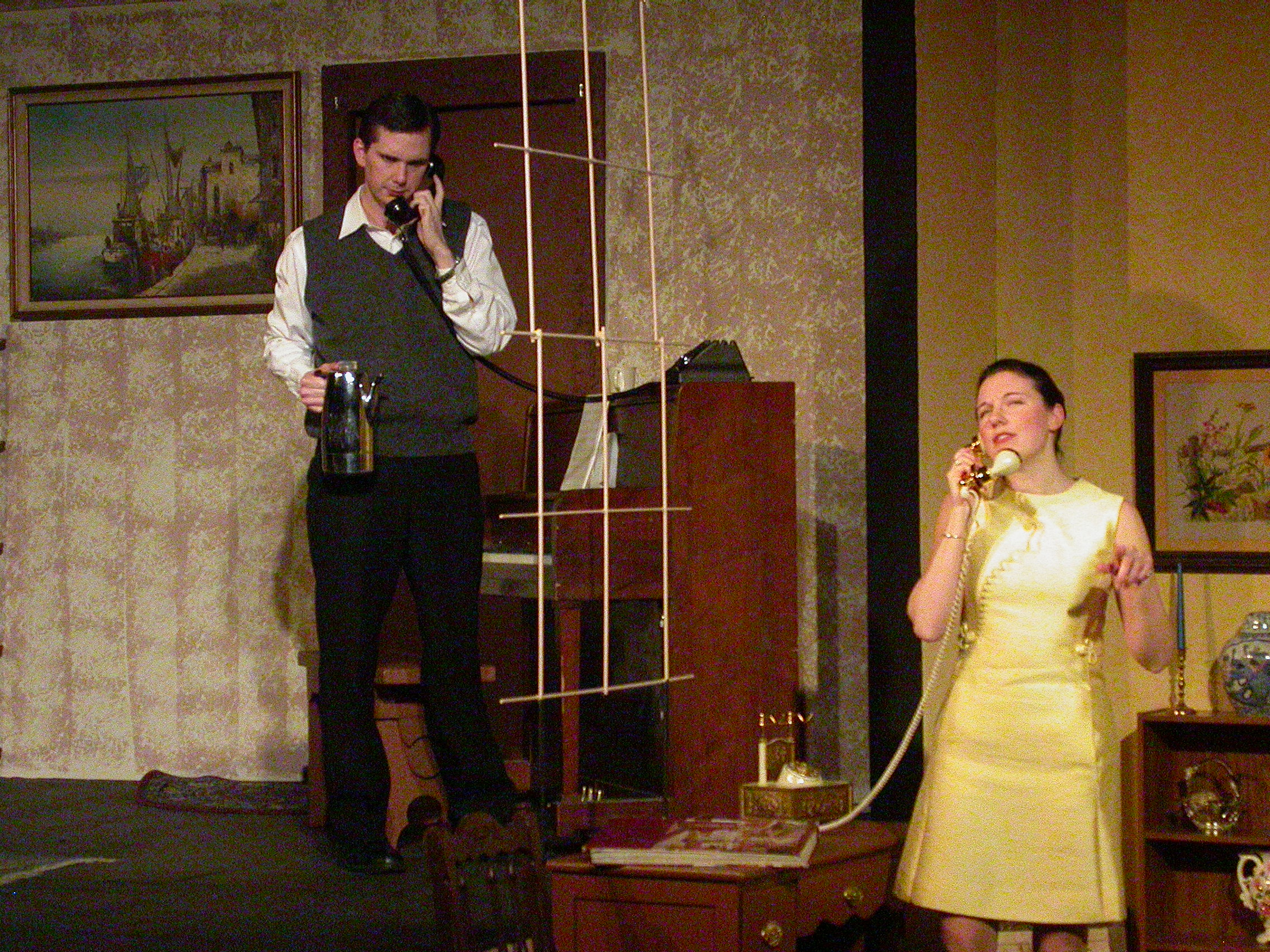
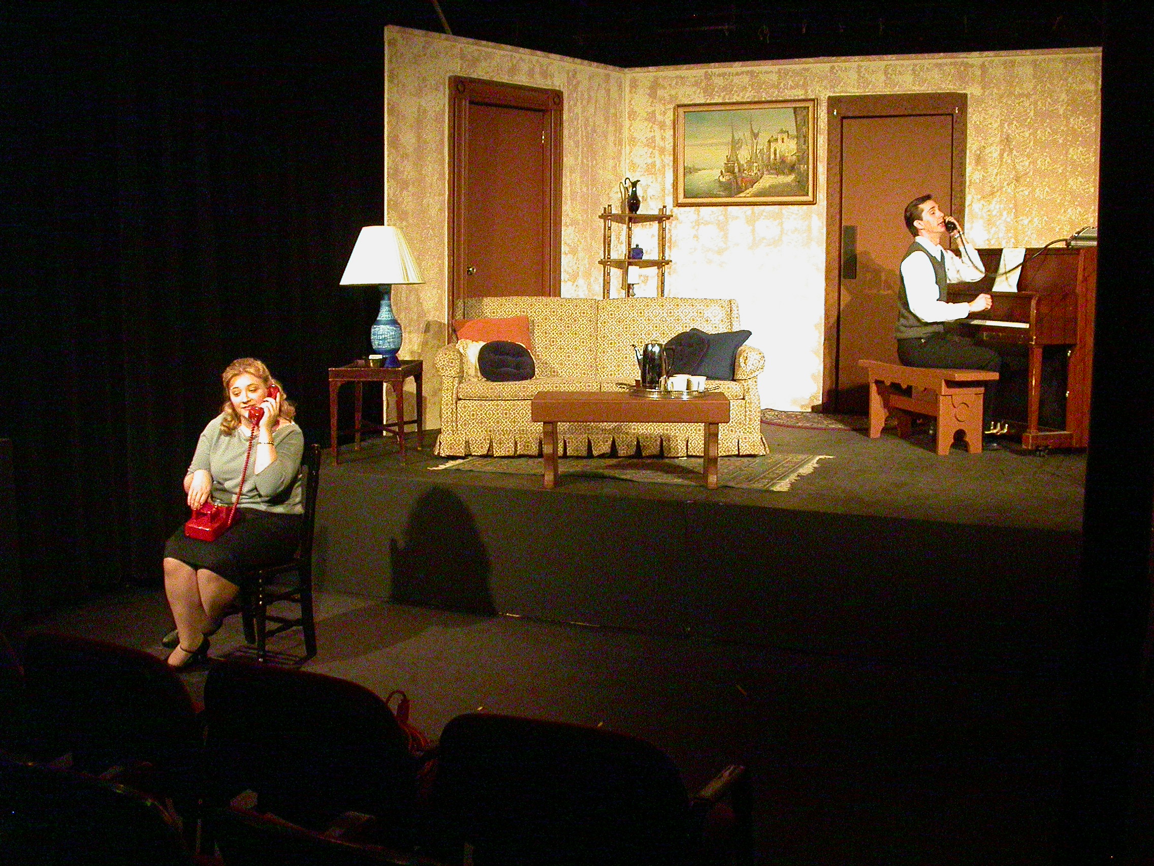
And often the person on the other end of a phone call:
The next year, we did a musical review in the same space. I wanted to see how many different kinds of lighting effects I could make in that space (people expect flashy lights in musical numbers), so I made a simulation to show the actor/directors what I had in mind for their version of Queen's Bohemian Rhapsodie. Here is the simulation I made, and here is a recording of a rehearsal that I made for comparison. Note that in both cases, it really starts getting interesting around 2:40. I have no idea any more where on Earth I got that soundtrack for the simulation.
As long as I was making this web page, I thought I would throw in some examples of a few design choices that I've found particularly striking and/or that I'm particularly proud of (that I still had images and/or video clips of, of course).
I have found the color red can be very striking when used carefully. Here is a scene from a show I did in 1991 called The Little Clay cart. As the villain strangles the heroine, her bright blue sari turns jet black, and the color drains out of the rest of the stage, too.
In 2002, I designed the musical Jekyll & Hyde, and I wanted to make some simulations to see how some of my ideas might manifest. I was able to get an image of the backdrop we were going to rent, and I wrapped that image on a rectangle to make a backdrop in the simulation. So these slides show what I thought the scene might look like when flooded with red light for a murder:
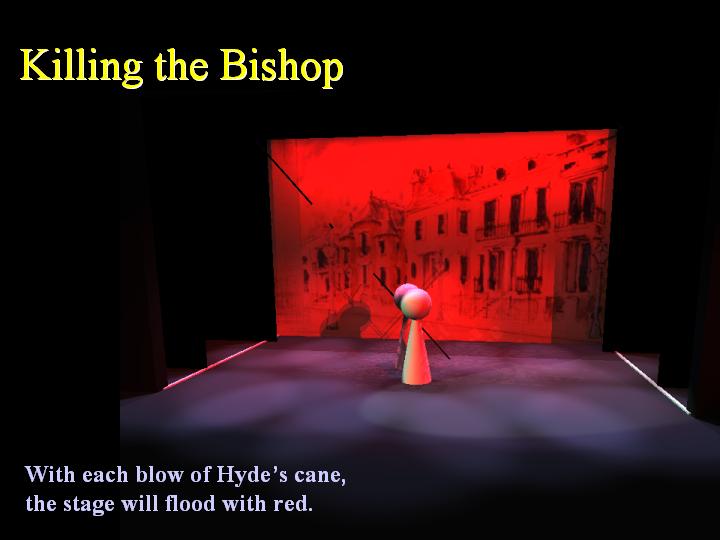
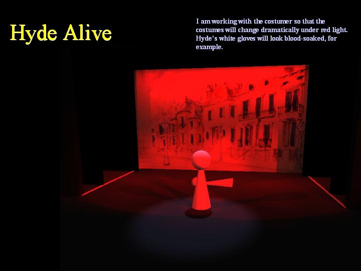
You can see this clip of the scene from the show that makes it clear how well the simulation worked.
I also modeled how the scene would work when Jekyll and Hyde sing their duet; the actor has to switch characters from verse to verse, so I had the lights change with the character. The backdrop and the backlighting are in complementary colors:
Jekyll:
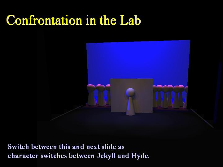
Hyde:
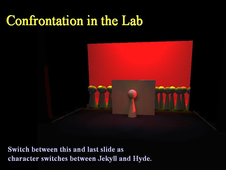
And here is a clip where you can see this in action.
This scene ended with one of... no, THE most complicated transition
I've ever had to design. We had multiple flybars going up and down,
sound cues AND music cues, props had to be removed, light cues
(including a chase that had to fade to a special, then to a whole
scene), set pieces had to move around and out of the way of the
actors, who were all changing position, while they were singing! My
camera at the time couldn't film the whole transition, so here it is
in two short pieces:
End of song
Transition
And
here is the final moment of
the show, just because it's so pretty. One night, I actually heard
someone in the audience blurt out "wow!"
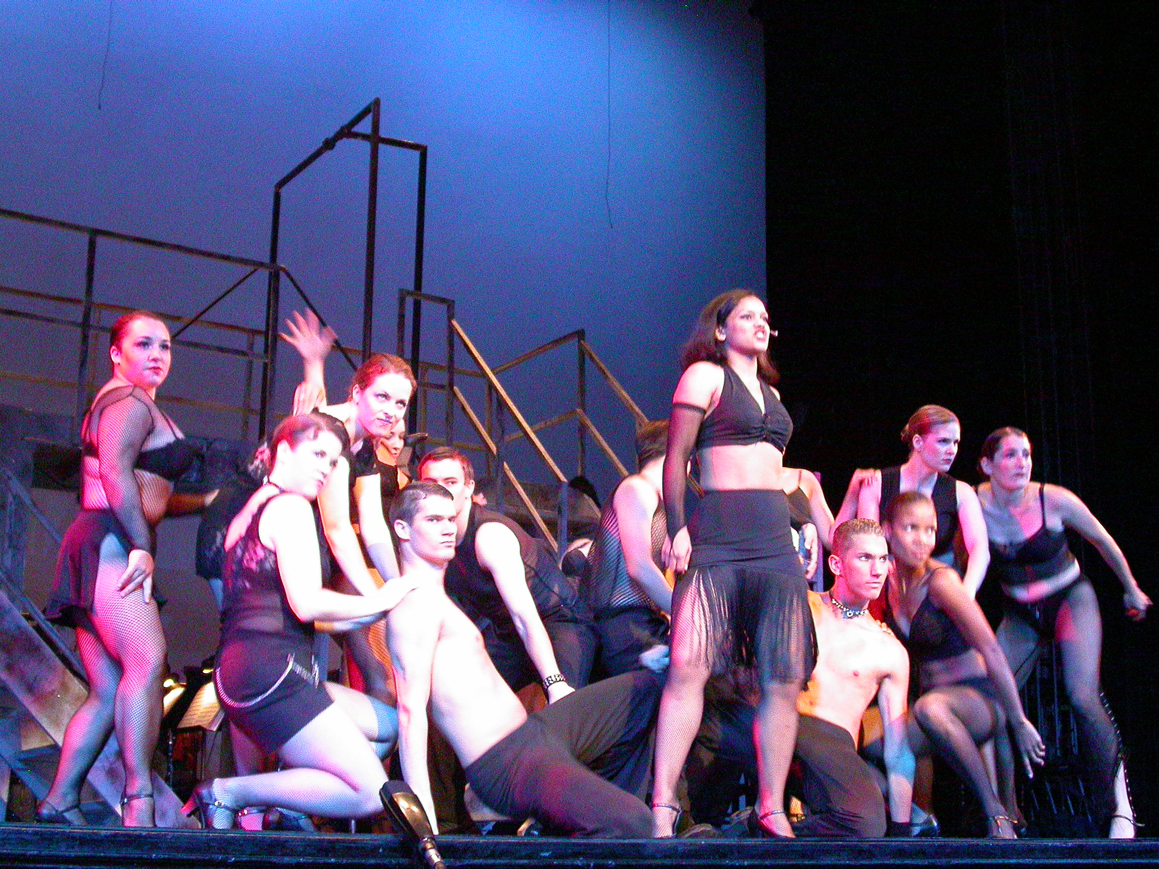
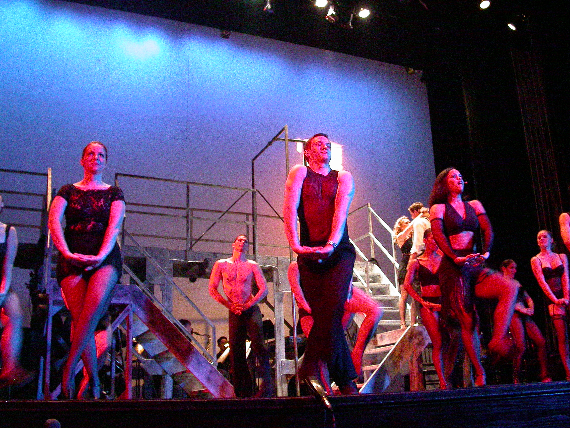
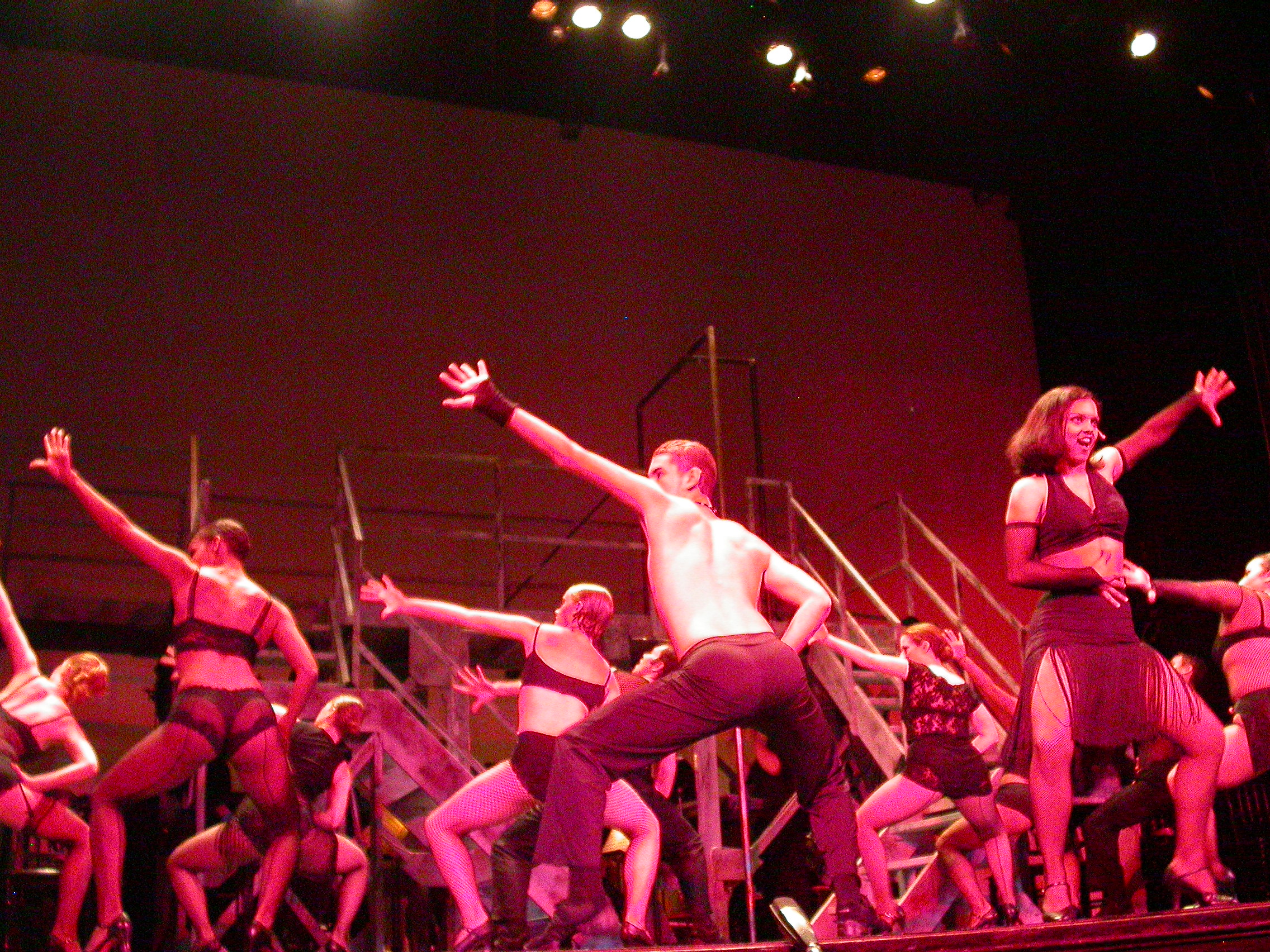
Here are some pretty shots from Chicago, 2003:
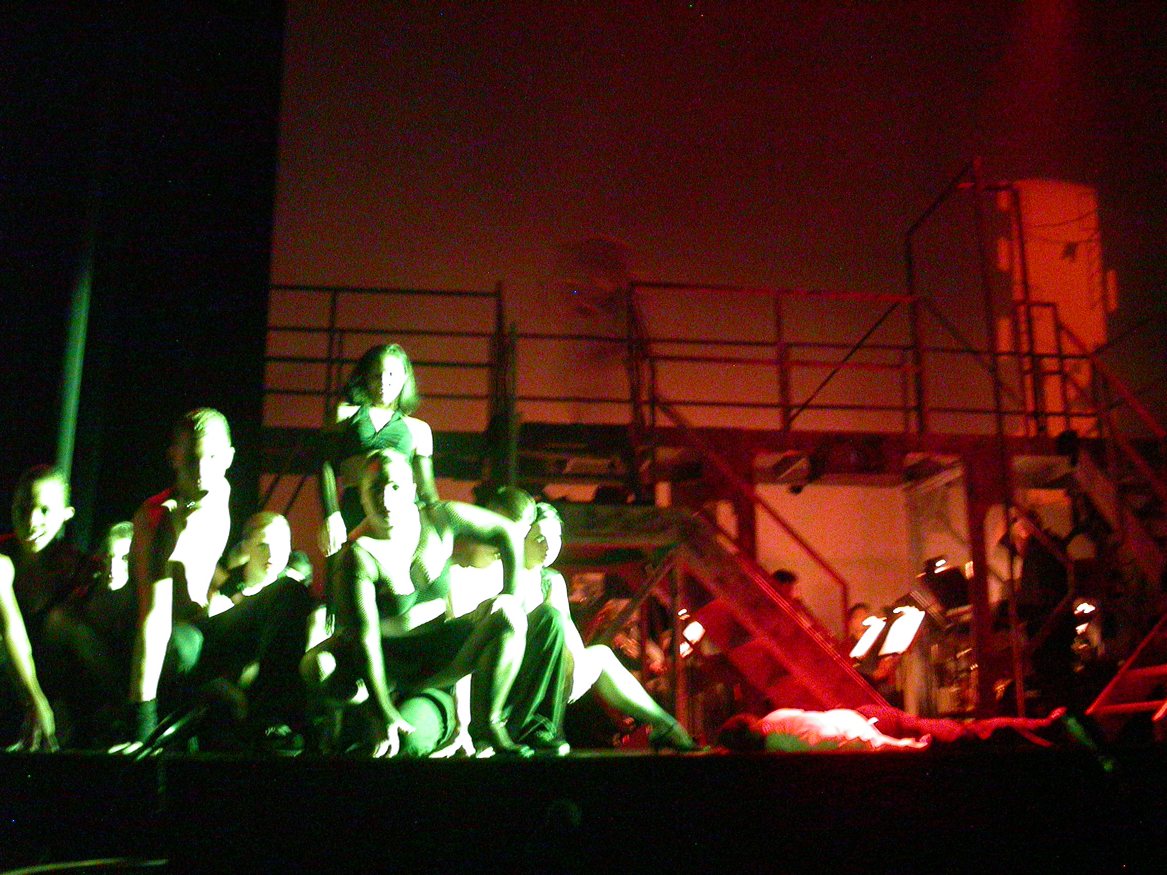
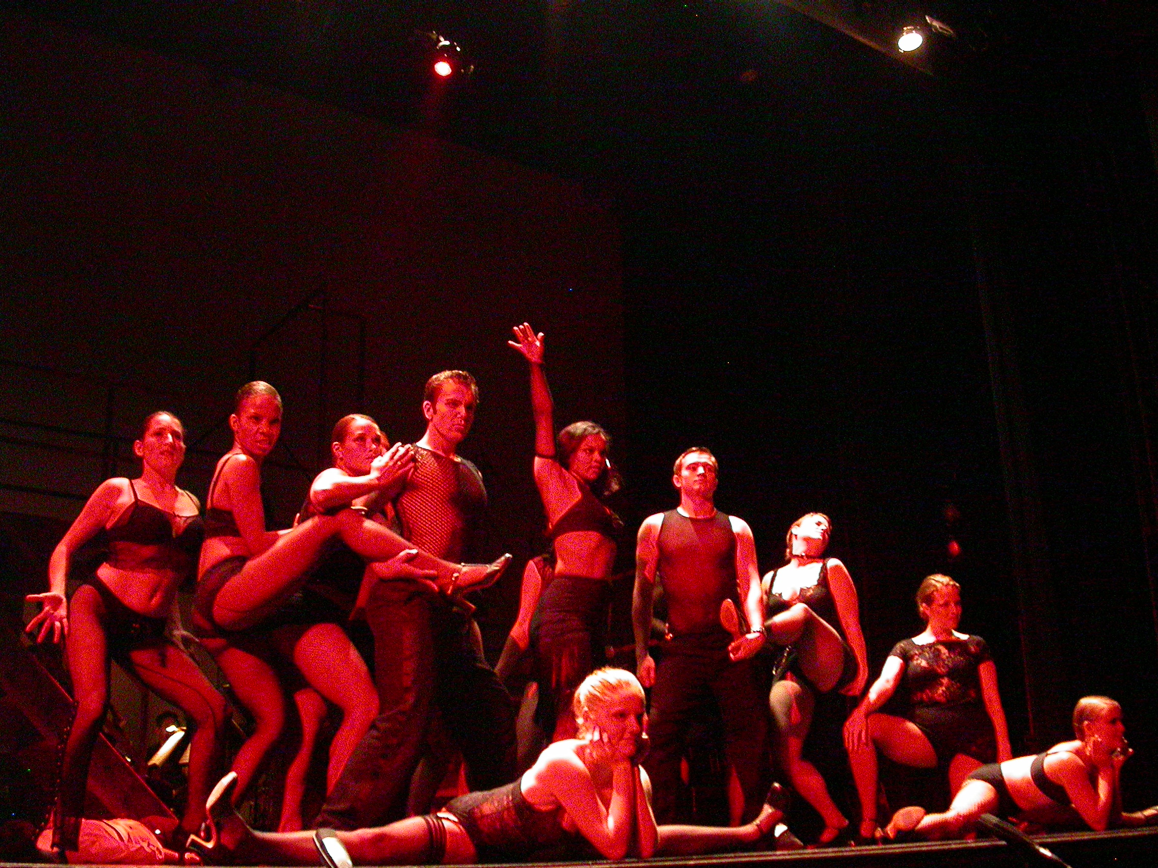
And here are some more from Cabaret, 2005:
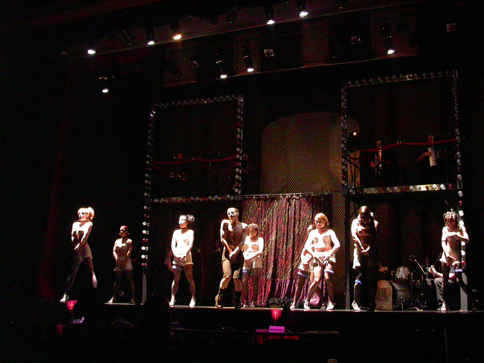
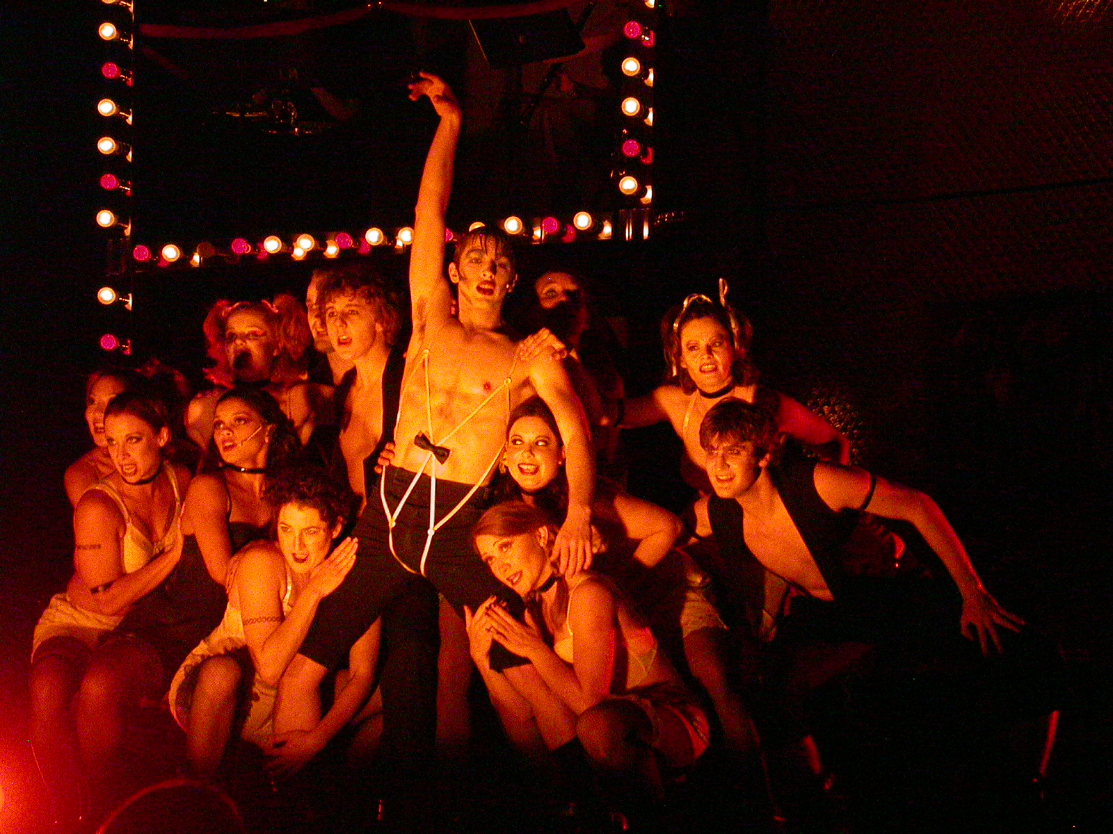

These shots illustrate the power of color to make a striking tableau, as well as what you can do with side, top, and under-lighting. The last two are some intense moments with gobos -- the shattered glass of a brick being thrown through a window, and the final image was the end of the show -- we had that gobo specially made for the production.
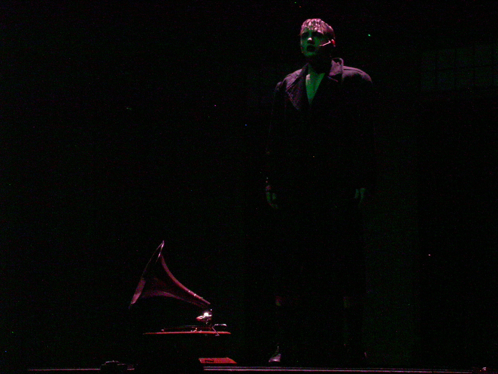
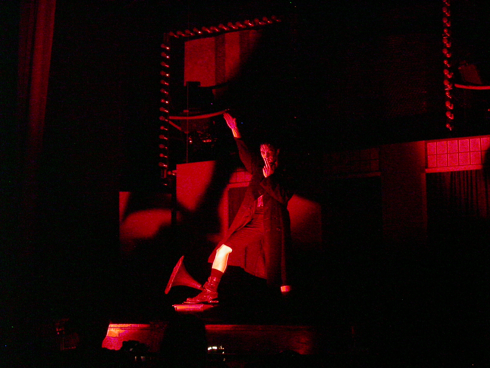
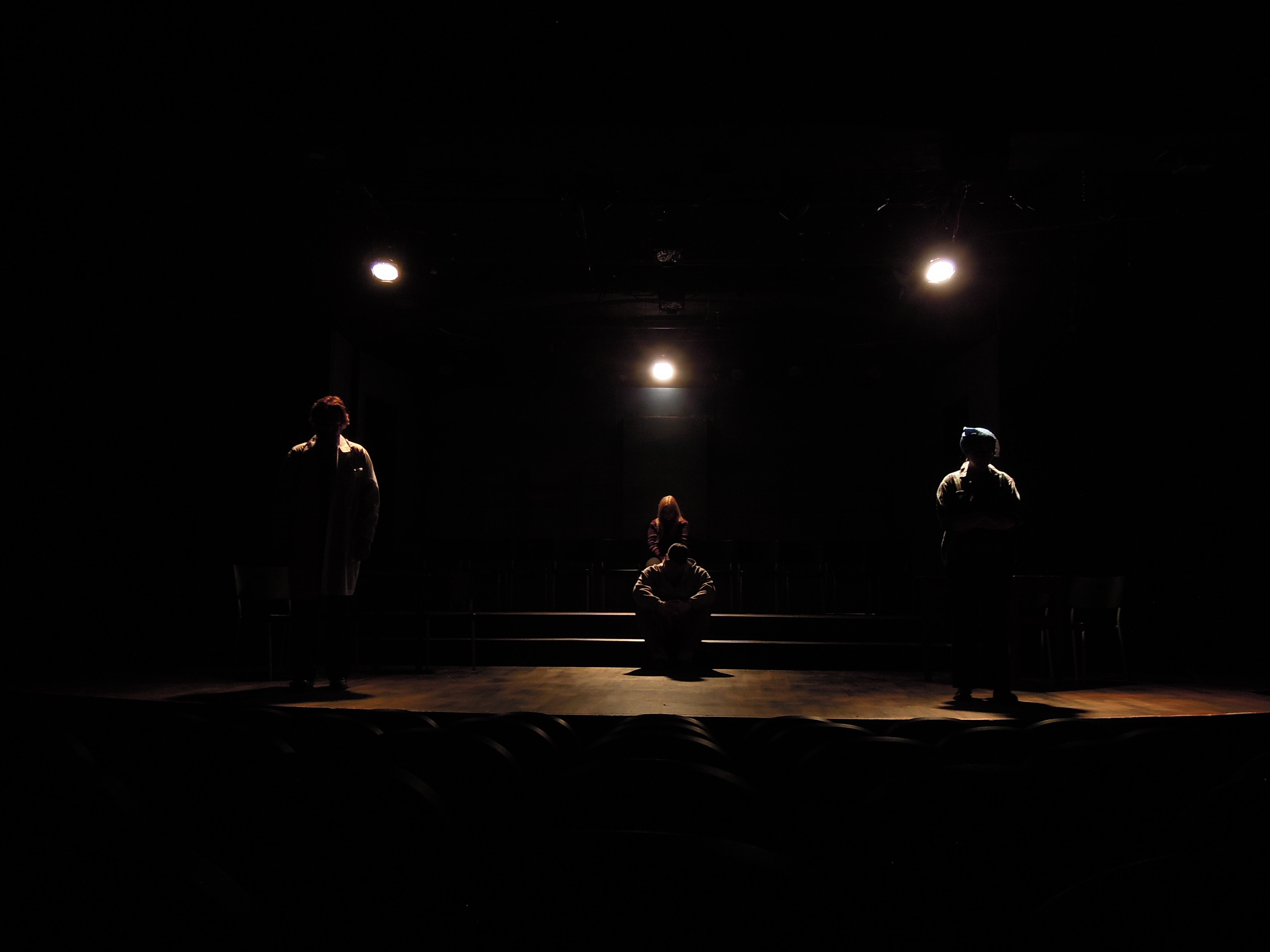
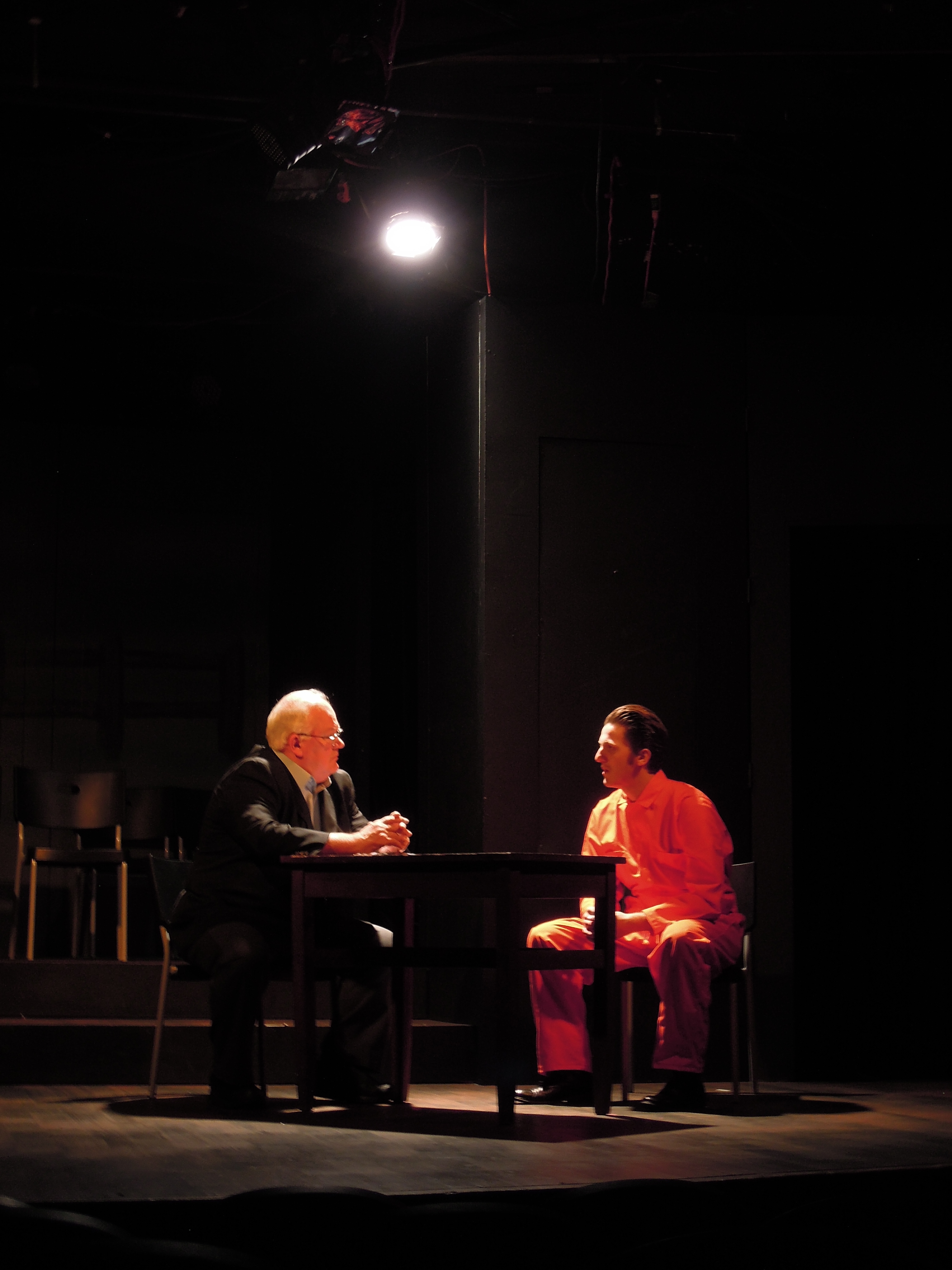
More recently, I designed for the Community Theater of Greensboro's production of The Laramie Project. This "staged documentary" needed to represent dozens of interviews and events in many different locations, all on a (mostly) bare stage.
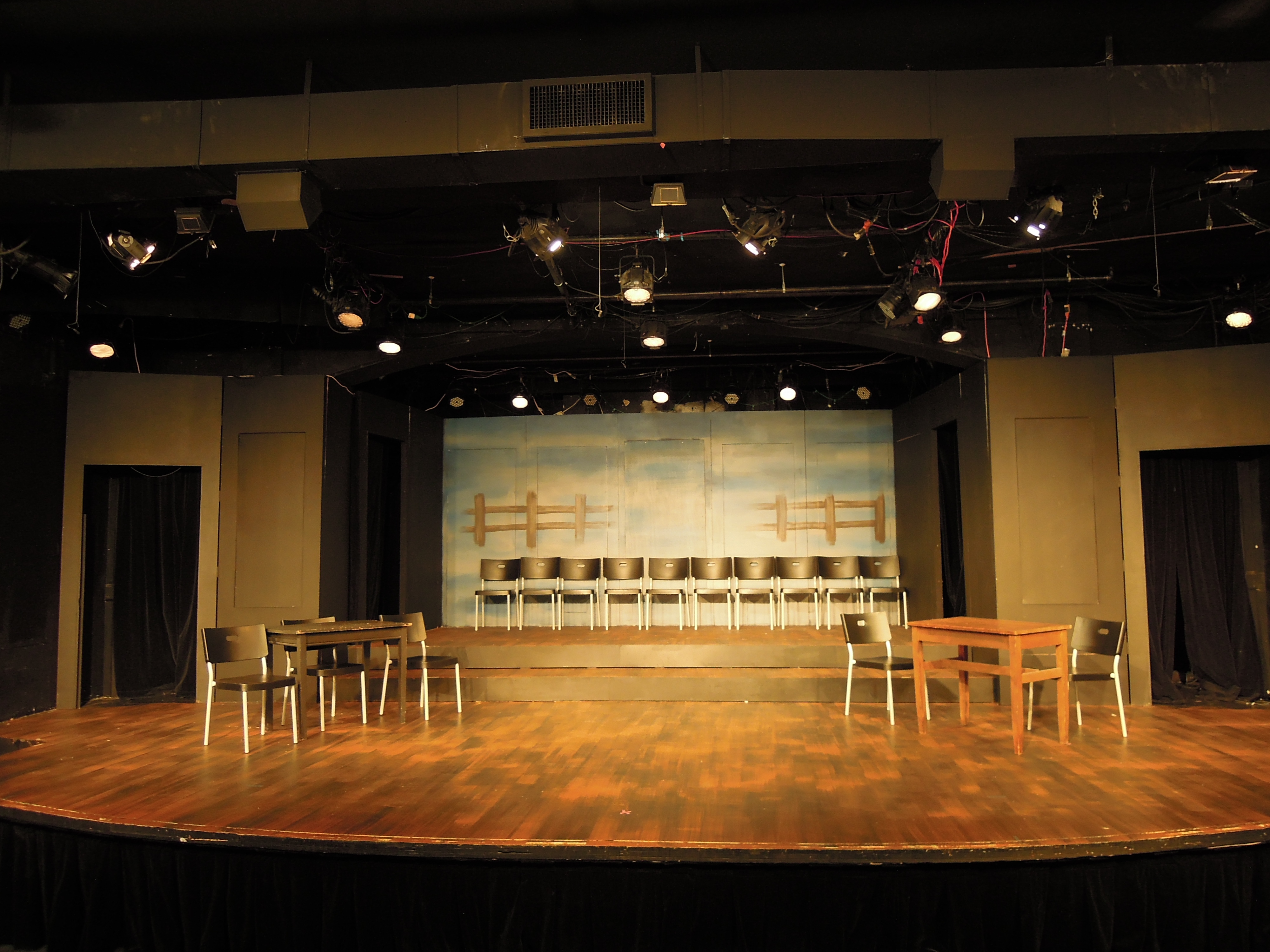
I used a lot of backlighting to set people apart from the background and create evocative tableauxs
Some of my favorite "looks" included the police interrogation room with the murderer:
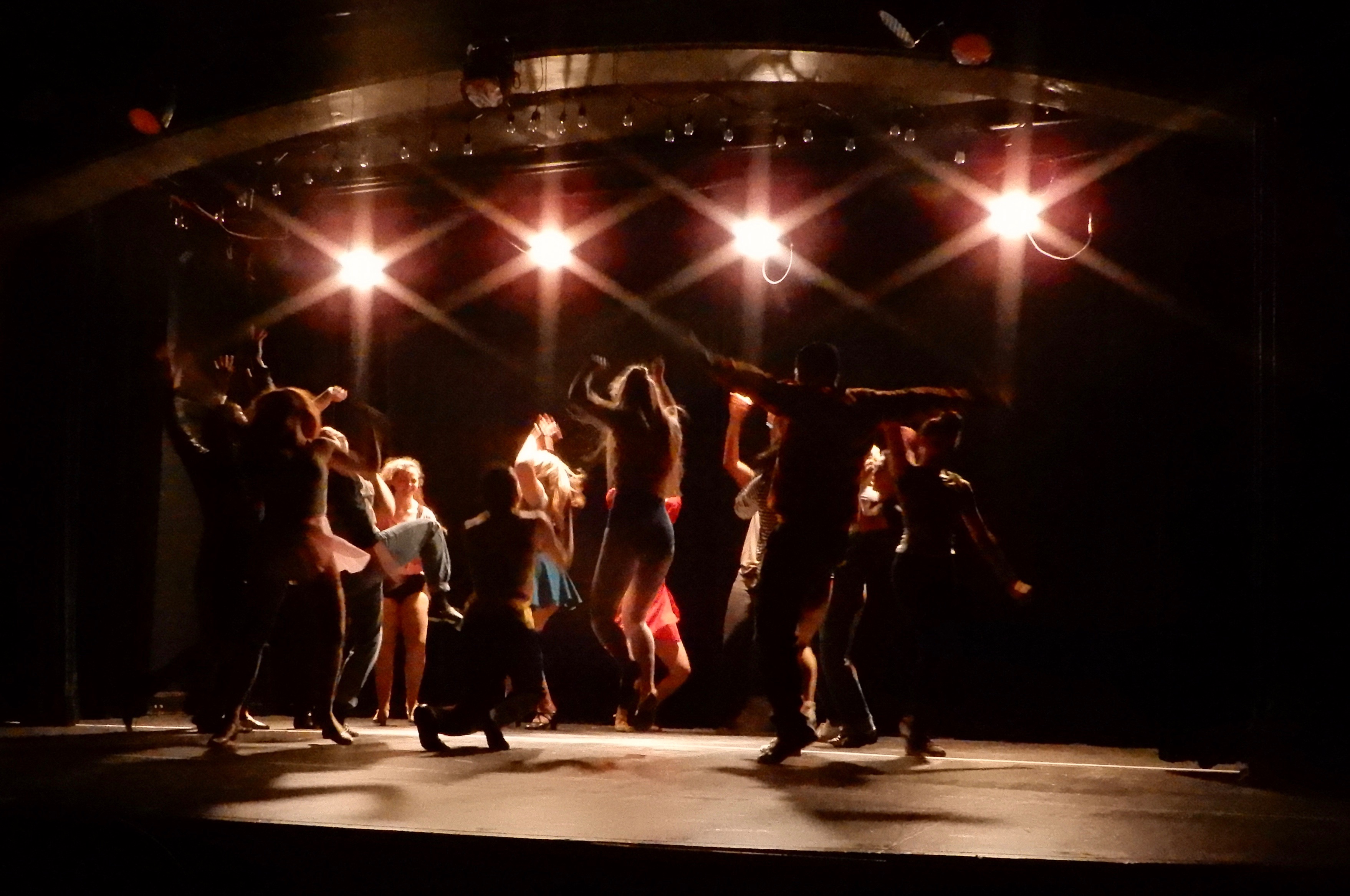
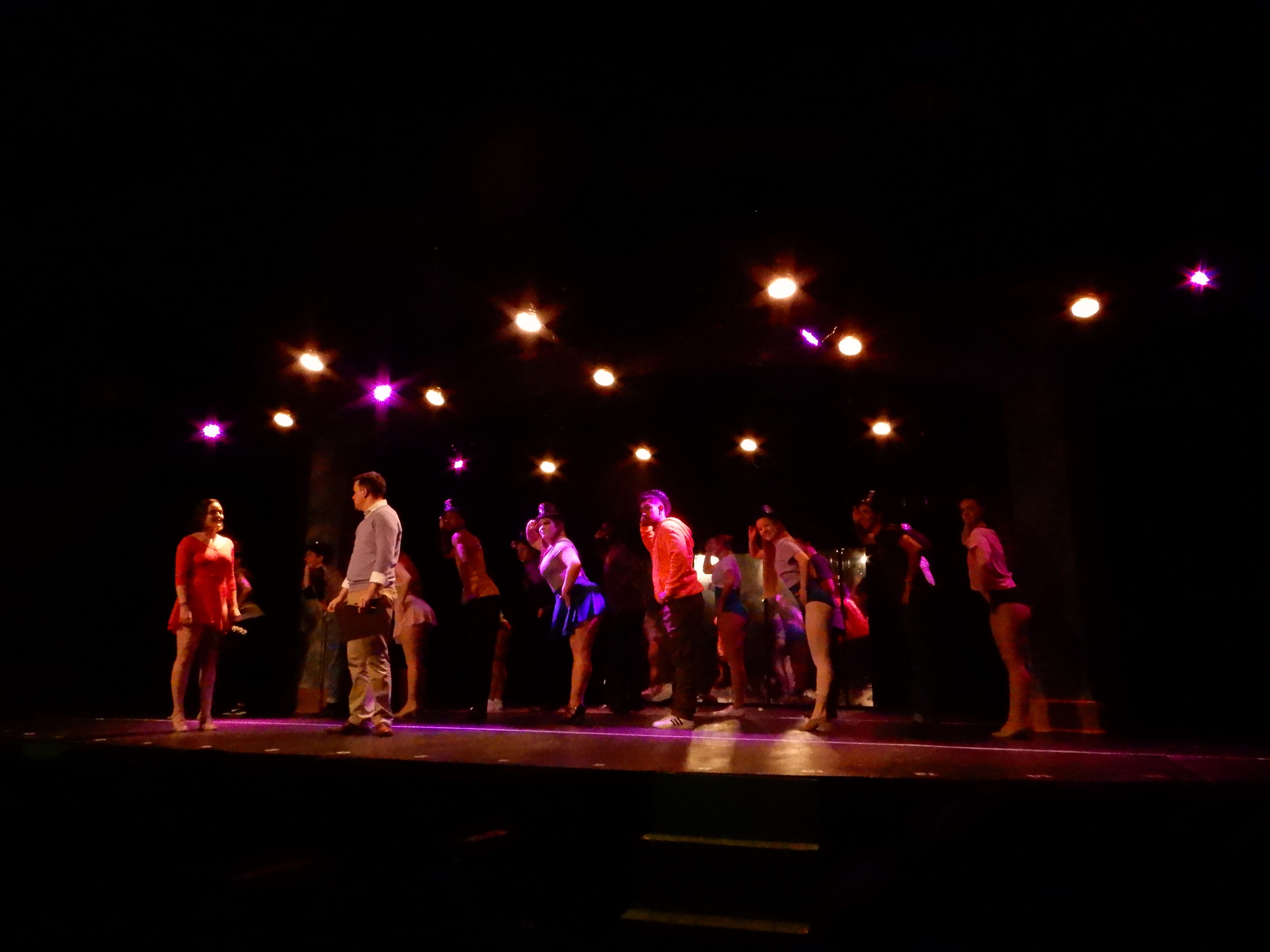
In the Fall of 2017, I did the design for A Chorus Line. The lights needed to look naturalistic during the audition scenes
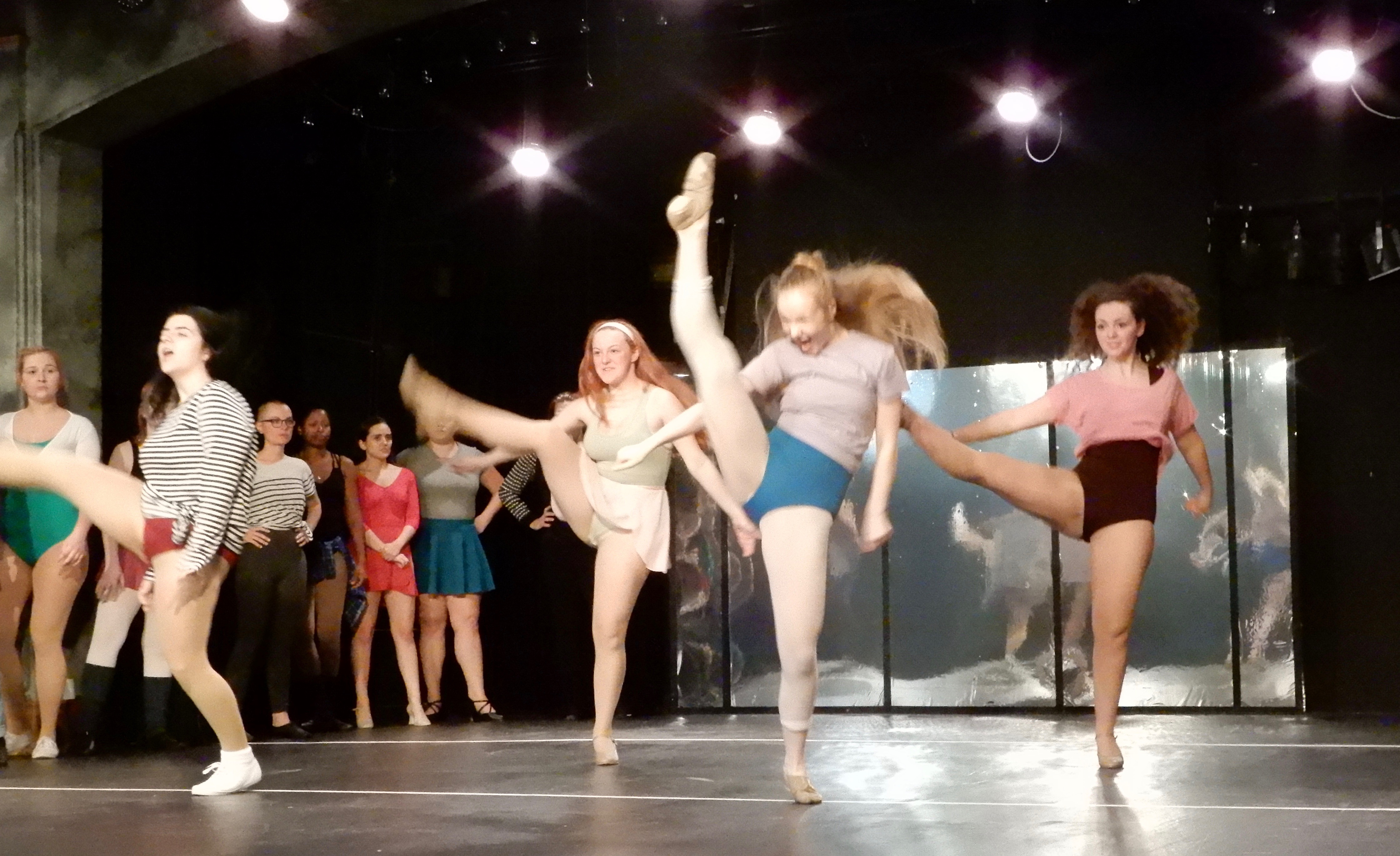
But then colorful and impressionistic during the dance numbers:
One of my favorite lighting moments was during The Music and the Mirror, when the dancer was backlit from the audience, but frontlit in the mirror:
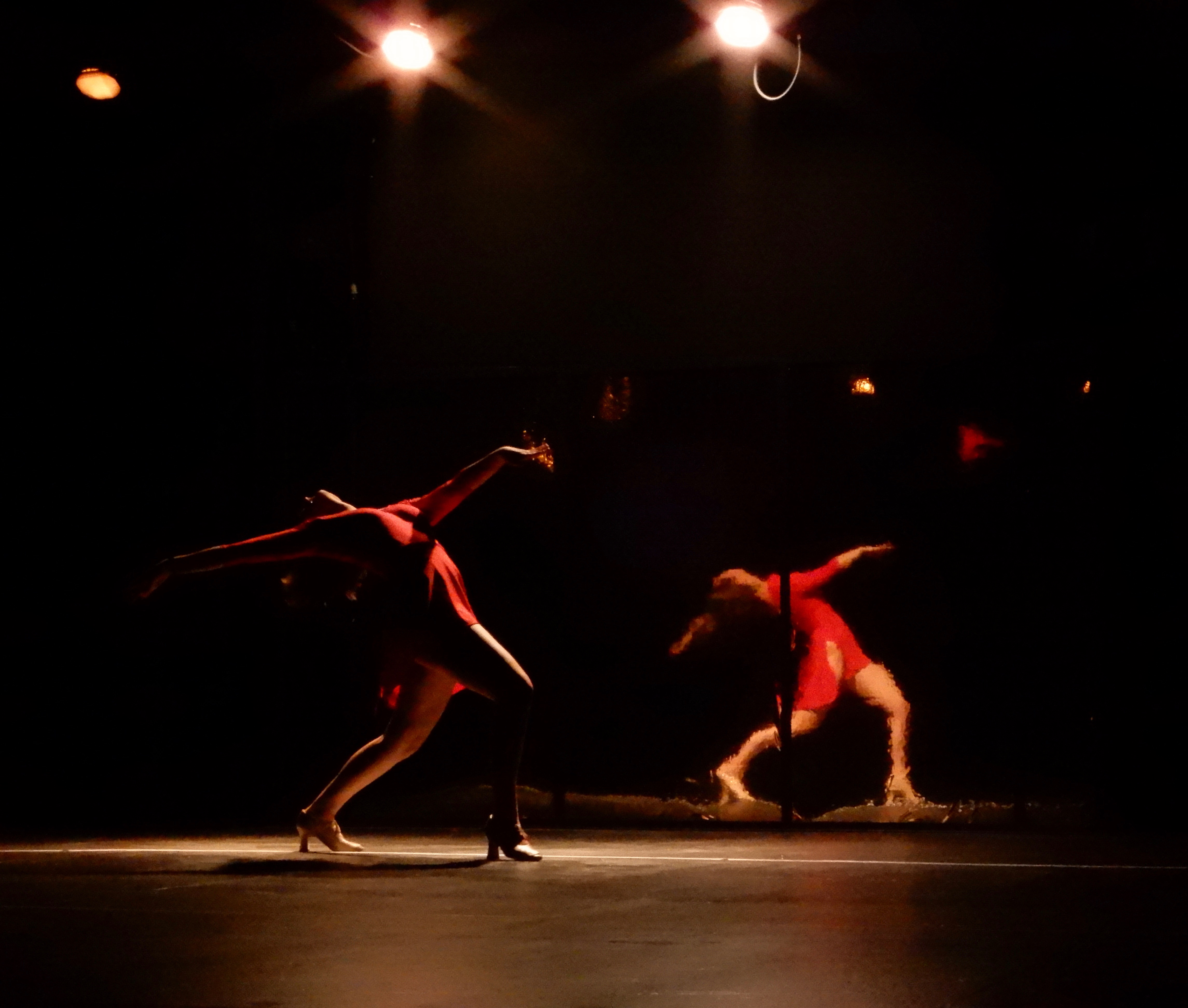
Lighting mirrors is always tricky, as you don't want reflected beams to blind the audience.
I've got lots more, but I think these get the points across. :-)